Email marketing
Quick start guide
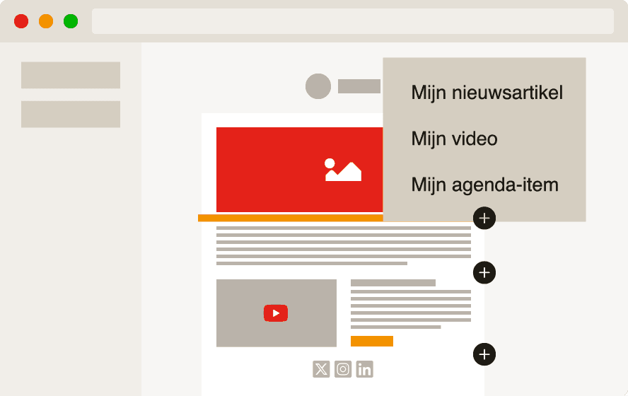
Getting started with email marketing
Templates & templates
Personalize & segment
Digitally accessible newsletters
Do you want to reach more people with your newsletter? By applying digital accessibility, you make your emails readable and usable for everyone.
Everyone deserves to participate, including online. Make your newsletters so accessible that everyone can actually receive and understand your message.

Want to check it yourself?
With this checklist, you not only make the content of your newsletter friendlier and clearer but also accessible to a much broader group of readers. And to be honest: it always improves your communication.
Why digital accessibility is important
In the Netherlands, over 4.5 million people struggle with reading or using digital information. Think of people with visual impairments, low literacy, or dyslexia. With the introduction of the European Accessibility Act (EAA) on June 28, 2025, more and more organizations will be legally required to communicate digitally accessible.
What is a digitally accessible newsletter?
Accessible communication increases your reach and engagement, radiates care and inclusivity, and is legally required in many sectors (such as government, healthcare, education). An accessible newsletter meets the WCAG guidelines (Web Content Accessibility Guidelines). Broadly speaking, a digitally accessible newsletter should:
contain clear headings in a clear structure;
be equipped with alt texts for images and videos;
be usable for and in screen readers;
have sufficient color contrast in design, images, and text;
have good graphic readability, with clearly visible letters and a clear line spacing;
consist of understandable language.
How do I create a digitally accessible newsletter in Laposta?
To make a digital newsletter digitally accessible, we distinguish three areas of focus:
Technical: the structure of the (html) code of the newsletter;
Design: the use of colors, text size, and images;
Content: the subject line, preview text, preheader, and the texts.
We would like to explain these three areas of focus for you.
1. Technical accessibility
The display of a newsletter is captured in html code. The structure of this html is important for the accessibility of the newsletter. Technical accessibility requires customization. Therefore, it is currently unfortunately not possible to create fully technically accessible newsletters in our drag & drop editor.
What can be done: we offer the opportunity to have a custom Joe template developed with which you can fully comply with the WCAG guidelines. This type of template is fully optimized for screen readers, logical HTML structure, contrast, accessible buttons, and more.
You can have a Joe template developed if you use Laposta with a paid subscription. Our designers will assist you with a custom template that fits your house style and meets the technical accessibility requirements. Meet Joe below to read more about it and feel free to contact us about it.
If you want to know more about technical points of attention for digitally accessible newsletters, or perhaps want to develop, program, and import a template into Laposta yourself, read more here about the structure of the html code in the context of digital accessibility.
Meet Joe
With a custom template of the Joe type, you really go pro. This type of template is designed and programmed by our designers, for desktop and mobile display. You can incorporate all your house style elements into this. You can also place automatically generated content and ensure that your newsletter meets all requirements regarding digital accessibility.
2. Design and accessibility
A good newsletter not only looks good, but is also visually understandable for everyone. Graphic accessibility is about smart choices in color use, typography, and imagery, so that even people with color blindness or visual impairments can read your newsletter well.
Pay attention to sufficient color contrast between text and background, avoid information that is only conveyed through color (such as a green or red button without text), and choose clear, easily readable fonts. The layout also plays a role: ensure a calm layout with sufficient white space and a clear hierarchy in titles and text blocks.
When creating a newsletter in the drag & drop editor, also pay special attention to graphic accessibility in the mobile display and test it in, for example, dark mode.
Here you can find more information about design in the context of accessibility.
3. Accessible content
An accessible newsletter starts with the content. Not everyone reads smoothly or understands complicated language. Therefore, it is important to build your newsletter clearly and understandably. Use a clear structure with short paragraphs, clear subheadings, and bullet points where possible. Keep sentences simple and avoid jargon or acronyms without explanations.
Also, think of people reading the newsletter with a screen reader: describe what is visible in an image where necessary (via alt text), and ensure that link texts clarify where they lead. Avoid vague sentences like "click here" or "read more" and prefer to say: “Read more about digital accessibility.”
With a good content setup, you not only increase accessibility but also the chance that your message truly reaches everyone.
This is how you make the content of your newsletter accessible(er)